

ACME Markets
Opened: 2015
Previous Tenants: A&P
Location: 1060 Raritan Rd, Clark, NJ
Photographed: December 2020
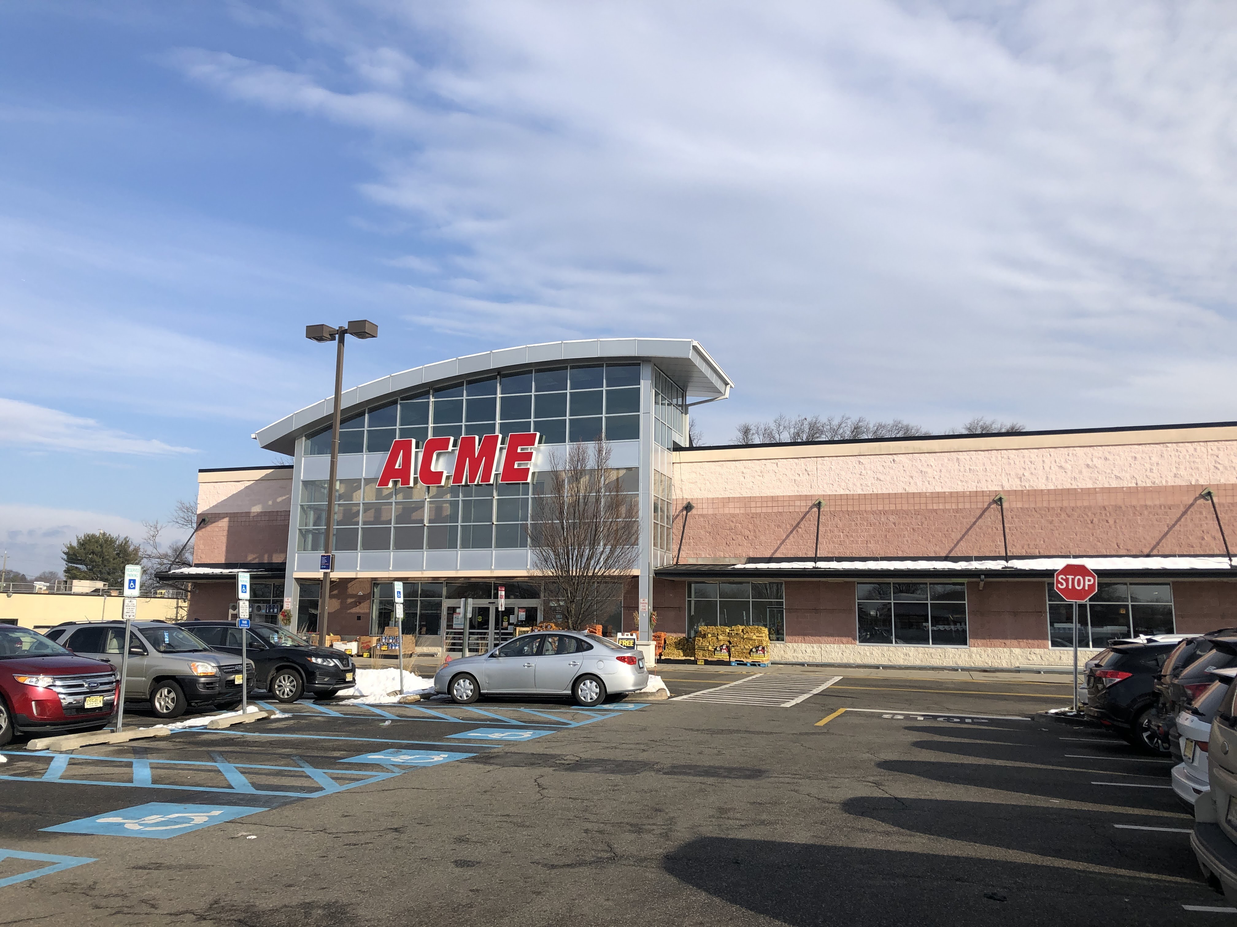


Today we're here in Clark, NJ -- just off exit 135 on the Parkway -- to tour the middle-sized supermarket in town. This ACME is 55,000 square feet, with a 44,000 square foot Whole Foods just over half a mile to the northeast, and a 72,000 square foot SRS-owned ShopRite at almost exactly half a mile east. Clark has plenty of supermarkets, but they all do a very good business because they also draw from surrounding towns. In any other location, an ACME with a ShopRite and a Whole Foods so close might be in trouble, but this one does a very good business and is quite a beautiful store.

The store was built around 2005 as a new-build A&P, replacing a much older store in downtown Clark that we'll see shortly. The store opened with a beautiful version of Fresh 2.0 and in the summer of 2016 was remodeled to Quality Built. As we'll see, though, the bones of Fresh 2.0 are still present, unlike some of ACME's more recent, more extensive Quality Built remodels.

We enter to the grand aisle, with produce lining the left side and deli/prepared foods on the right. Customer service is just to the right of the entrance on the front wall with floral just to the left of the entrance. Bakery, seafood, and meat line the back wall with dairy on the far end and frozen foods in the last aisle and a half, and pharmacy in the front right corner.

Customer service looking very good with a nice clean white paint job and lighting left from Fresh 2.0. Prepared foods face this area, although I do think the Quality Built decor works better with the black fixtures ACME has been putting in the remodels instead of the older white fixtures from Fresh 2.0.

Produce lining the left side of the grand aisle. As much as I like them, the category markers along the top of the cases from the initial conversion are starting to fade as we see here. Plus, when the stores are reset, the category markers frequently don't match the actual stock.

Deli and prepared foods lining an island opposite produce. It looks to me like there was no wall long enough to accommodate "ACME Corner Deli" so it was shortened as we see here.

Boar's Head awning from Fresh 2.0 remains, as does the cheese department (although the hanging sign is new)...

Newer Quality Built remodels replace these single-tier cheese displays with more space-efficient upright cases. Still looks good here, though.

Spacious bakery in the back corner of the grand aisle.

Service seafood and meat behind the deli/cheese island on the back wall, with packaged meat lining the rest of the back wall. In the grocery aisles, the store definitely feels less dated than the grand aisle. The first grocery aisle lines the back of the deli island...

The grocery aisles are clean, spacious, and well-stocked. I believe ACME replaced the lighting in the store when they opened, and it's certainly a very bright space. I remember being in a lot of these cavernous A&Ps that felt dark and dingy because the lighting wasn't bright enough. Didn't help that A&P probably had half the lightbulbs burnt out.

Clearly, that's not a problem we have here! As we've seen, maintenance in 90% of ACME's acquired A&P stores has been top-notch.

Cold cuts and milk in the corner on the back wall, with frozen in aisle 11 and one side of 12, and dairy lining the other side of 12 which is the last aisle.

I don't believe ACME replaced any of the fixtures in the Quality Built remodel except maybe the seafood cases, I didn't get a good look at those. The frozen and dairy cases are definitely 2005-era. (Side question here for anyone who might know... this store seems to be about the same age as Denville, the Fresh 1.0 prototype. Those are both around the same time that Kenilworth was remodeled to Fresh 2.0. Does that mean A&P was using both Fresh 1.0 and 2.0 at the same time? If so, why would they do that?)

Looking up towards the front wall in aisle 12, the last aisle.

Pharmacy and health and beauty in these short aisles in the front corner of the store. The flooring (here and in the rest of the store) is left from Fresh 2.0, as we saw in Newport.

Front end looking good (and decorated for Christmas). This store seems to do quite well despite being very close to its competition, including the ShopRite I mentioned. I've been to that store many times but have never quite seemed to get a store tour -- so come back tomorrow for a snapshot of the ShopRite of Clark!
Really nice store and great post! Always love seeing your coverage of Acmes. I think this location was among the first acquired stores to get the Quality Built decor. It was done really nicely here although I always find myself wishing the deli back walls in these stores were white. The blue and yellow combo... maybe not awful but definitely not right.
ReplyDeleteFirst time seeing the Deli without "Corner"! Other stores that have been short on space have "ACME" stacked above "Corner Deli". This was most recently done in the Jersey City store.
Interesting to see all six registers in the photo open aside from the four or five self-checkouts and hardly a customers checking out. ACME has dramatically changed its front-end management in the past couple of years. When the Pathmark/A&P stores were first converted, self-checkouts were yanked out and manned registers were few and far between. (Always a major issue at the Weehawken store. I raised hell so badly one day that the MANAGER opened and ran a register!) Now they've done a complete 180 with putting self-checkouts back in AND having more full-service registers open then ever! The West New York store was a nightmare for years. Rarely was there ever more than two registers open with long lines. The registers at the back entrance were NEVER open. Now... 8 self-checkouts with the full-service register at the back of the store always open! (That cashier also monitors the two self-checkouts) Yesterday morning I was in the Edgewater store. They had 8 of the full-service registers open along with the 5 self-checkouts! The store was not nearly busy enough to justify all of those registers. In fact, most cashiers had NO customers. Not the first time I've seen this situation at the Edgewater store but you won't find me complaining about it! :)
I also noticed the New Canaan store (a former Food Emporium) also had its deli sign without "Corner".
DeleteThanks, always glad to hear from you! I think you're right, and I know Kenilworth also got Quality Built early (starting May of 2016) so is it possible they were going regionally? Or it's also quite possible that Clark and Kenilworth are both pretty high-volume stores, so it would make sense they were remodeled early.
DeleteNo kidding on the front-end management change over the years! I avoided ACME in large part for many years for that very reason, although I liked the store. Since the coronavirus, though, I've been at ACME (Boonton, Denville, or Kenilworth) pretty much every week and it's been consistently easy and fast to check out. When I've had to wait a while at Kenilworth, it's because every register has been open (and man, Kenilworth is huge with I think 12 self-checkouts and 12 service registers) and the store is just crowded. Did you ever think we'd be saying something like that about a northern New Jersey store 10 years ago?!
As for New Canaan, thanks for bringing that up! I see that in photos online. Looks like it's another situation of a short wall, although that deli is certainly on a corner (but an extroverted corner, which is unusual).
Absolutely love the glass facade... it looks so good. I'm glad ACME kept it. Quality Built looks very good in this store, too. (Unfortunately, I don't have an answer on your Fresh 1.0/2.0 question...)
ReplyDeleteYeah, it looks fantastic and actually kind of looks like what ACME briefly had in Limerick... https://acmestyleblog.blogspot.com/2011/01/soon-to-be-former-acme-limerick-pa.html?
DeleteWow... it sure does!
DeleteMaybe they decided to be more accurate on the deli, since it (technically) isn't in a corner?
ReplyDeleteOn the lighting, was this the type of store with the shelf lights (looks like they are on the one side of that first aisle that is the back of the deli)? That often seemed to make it look less bright, since the light was only on the items and not the entire store space like a ceiling mounted light system is.
That's quite possible too, since I assume the sign could hypothetically extend around a corner.
DeleteAs far as the lighting, that sounds very logical but it seems like this store didn't have the in-shelf lighting... https://www.flickr.com/photos/31660989@N05/22062372962/in/album-72157658128850363/
Weird, did they actually add it for just that one shelf (or maybe somehow that one had it)? Unless that wooden border along the top of the aisle (in your shot of the aisle behind the deli) is something else (but it looks brighter behind it)...
DeleteGood catch. It does look like that one is shelf-lit, but as for the rest, I'm as confused as you are. I can't find any pictures online of the store as an A&P that show on-shelf lighting, and I see a few from Dan Asnis (one of which I linked above) that distinctly show the store without on-shelf lighting in the A&P days. I'm fairly certain that the lighting over the aisles matches the A&P-era lighting instead of the ACME-installed lighting. Check the picture of customer service -- the light fixture along the front aisle is from A&P, and is the same as what's in the grocery aisles, and the light fixture running along the deli/prepared foods counter is from ACME but noticeably different. So, unfortunately, I have no conclusions to add. But thanks for the details and speculation!
Delete